UI Components That Actually Work
Learn button design, form styling, card layouts, and navigation patterns used by successful Malaysian websites
Why Components Matter
Components aren’t just design elements—they’re the language between designers and developers. We teach the fundamentals that make your interfaces feel responsive and intuitive.
Whether you’re building a startup website or redesigning an established platform, understanding button states, form field hierarchy, and card proportions directly impacts user experience. We’ve worked with over 200 Malaysian businesses since 2019, and the patterns here come from real projects that shipped.
- Practical techniques from active projects
- Malaysia-specific design considerations
- Code examples you can adapt immediately
- Regular updates as trends evolve

What You’ll Learn
Organized by component type with visual examples and implementation details
Button Styling
Hover states, active states, disabled states. We cover the psychology of button design and why certain colors and sizes work better for different actions.
Form Field Design
Labels, spacing, validation feedback. Forms frustrate users when they’re unclear. Learn how proper spacing and visual hierarchy reduce abandonment rates.
Card Layouts
Proportions, internal spacing, visual hierarchy. Cards organize information. We show how to make them work together in grids without feeling repetitive.
Navigation Menus
Responsive approaches, mobile patterns, interaction design. Navigation sets the tone for your entire site. We cover desktop, tablet, and mobile strategies.
Accessibility First
WCAG compliance, color contrast, keyboard navigation. Components must work for everyone. We include accessibility considerations in every guide.
Code Examples
HTML and CSS patterns you can use immediately. Every component includes working code samples with modern CSS techniques like Flexbox and Grid.
Featured Resources
Deep dives into specific components with detailed explanations and code

Button States That Users Actually Understand
How to design hover, active, and disabled states so buttons feel responsive. Includes accessibility considerations for better user experience.
Read Guide
Form Fields That Guide Users Through Input
Spacing, labels, and feedback techniques for forms that don’t frustrate. Real examples from successful websites show what works best.
Read Guide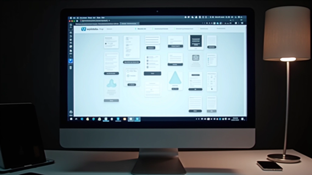
Card Layouts That Organize Content Clearly
Cards are everywhere on modern websites. We’re covering proportions, spacing inside cards, and how to make different card types work together visually.
Read GuideHow to Use These Resources
A structured approach to mastering component design
Understand the Fundamentals
Start with button basics—states, sizing, spacing. These principles apply to every component. We don’t skip foundational knowledge.
See Real Examples
We show actual websites using these patterns. You’ll understand why choices matter by seeing them in context on live Malaysian sites.
Apply to Your Work
Use the code examples and patterns directly in your projects. Every guide includes CSS and HTML you can adapt for your specific needs.
Real Feedback
“I wasn’t sure how to structure form validation feedback until I read the guide. Now I’m using the spacing patterns on all my client projects. The examples are actually useful, not just theory.”
“The button states guide saved me hours. I’ve got hover, active, and disabled working properly now. Plus the accessibility checklist at the end is something I reference every project.”
“Our team was inconsistent with card proportions across different sections. We studied the card layout patterns here and now we’ve got a system that actually works. Saves time and looks better.”
Frequently Asked
Is this just theory or can I use it immediately?
You’ll find working code in every guide. The examples are built from real projects, not academic exercises. You can copy patterns directly into your work and adapt them to your design system.
Do you cover responsive design?
Yes. Every component includes mobile, tablet, and desktop variations. We show how button sizing changes, how navigation adapts, and how cards reflow on different screens.
What if I’m a beginner?
Start with the button guide. We assume you know HTML and basic CSS, but we explain our choices. If something’s unclear, reach out—we’ll clarify it and improve the guide.
Are these patterns specific to Malaysia?
The fundamentals are universal, but we highlight how Malaysian websites approach these components. Cultural preferences and localization considerations are covered throughout.
How often are guides updated?
We update quarterly with new patterns and refined code. When CSS specifications change or new techniques emerge, we refresh the guides to stay current.
Can I use these in client projects?
Absolutely. The code is yours to use, modify, and ship. We only ask that you don’t republish the entire guide as your own work.
Ready to Improve Your Component Design?
Start with the fundamentals. Choose a topic that’s relevant to your current project and work through it. You’ll have practical patterns you can use within an hour.
Get in Touch